These are simple classroom activities done at the being of my Intro to Engineering Design class year.
Logo Design - 10/17/14
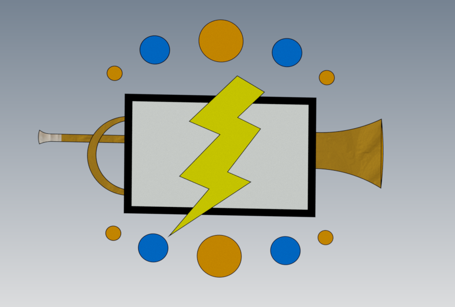
Point: I did not focus on using points.
Line: I used various line types to show strength in the monitor, action in the lightning bolt, and relaxation in the color circles.
Color: The blue and orange colors used are not only my favorite colors, but they are also colors that are associated with calmness.
Value: I did not focus on value.
Shape: Various circles and rectangles were used to create this logo.
Form: I added some form to the end of the trumpet to show that it's hollow.
Space: I left space by lightning bolt to draw attention to it.
Texture: I added a metal brass texture to the trumpet and a shiny silver to the mouthpiece to show that they are both metal.
Proportion: The circles are proportional to each other.
Balance: I balanced the logo as much as possible to give a symmetrical appearance.
Emphasis: I put emphasis on the lightning bolt but centering it and making it the largest object there.
Contrast: I made the computer screen black and white to contrast with the yellow lightning bolt.
Rhythm: I placed the circles in a pattern surrounding the logo.
Unity: I did not focus on unity.
Economy: I made a simple lightning bolt and trumpet that average individuals can still recognize.
| sketch.ipt |
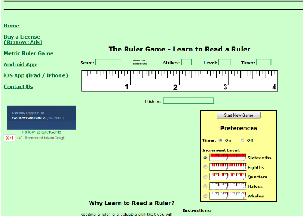
The ruler game - 9/10/14
This assignment was given to me to better my ruler reading skills.